

Aplica
Introducing a job search platform through the connected tasks of preparing applications, finding opportunities, and keeping track of progress.
- Role
- Frontend
- Year
- 2025–2026
- Industry
- Career technology
- Platform
- Web
01 / Overview
The context
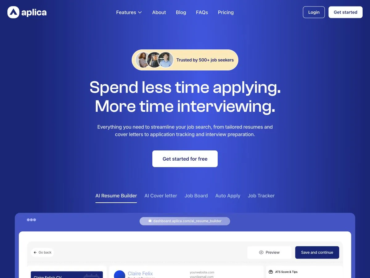
Aplica brings resume and cover letter tools, job discovery, application assistance, and tracking into a career platform. Its public website needs to explain how those features fit together. The frontend challenge is to present that range clearly, helping visitors understand the workflow and form a useful first impression of the product.
What I worked on
- Frontend implementation of the public web experience.
- Reusable sections for feature explanations and product previews.
- Responsive layouts and consistent navigation between key actions.
02 / A closer look
The work, in detail.
01 / Journey
Giving the workflow a clear starting point
Aplica brings several job-search tasks into one platform. I organized the public experience around a recognizable starting task, then connected it to the wider workflow. Preparing an application gives visitors a concrete way to understand the product's value before exploring other features.
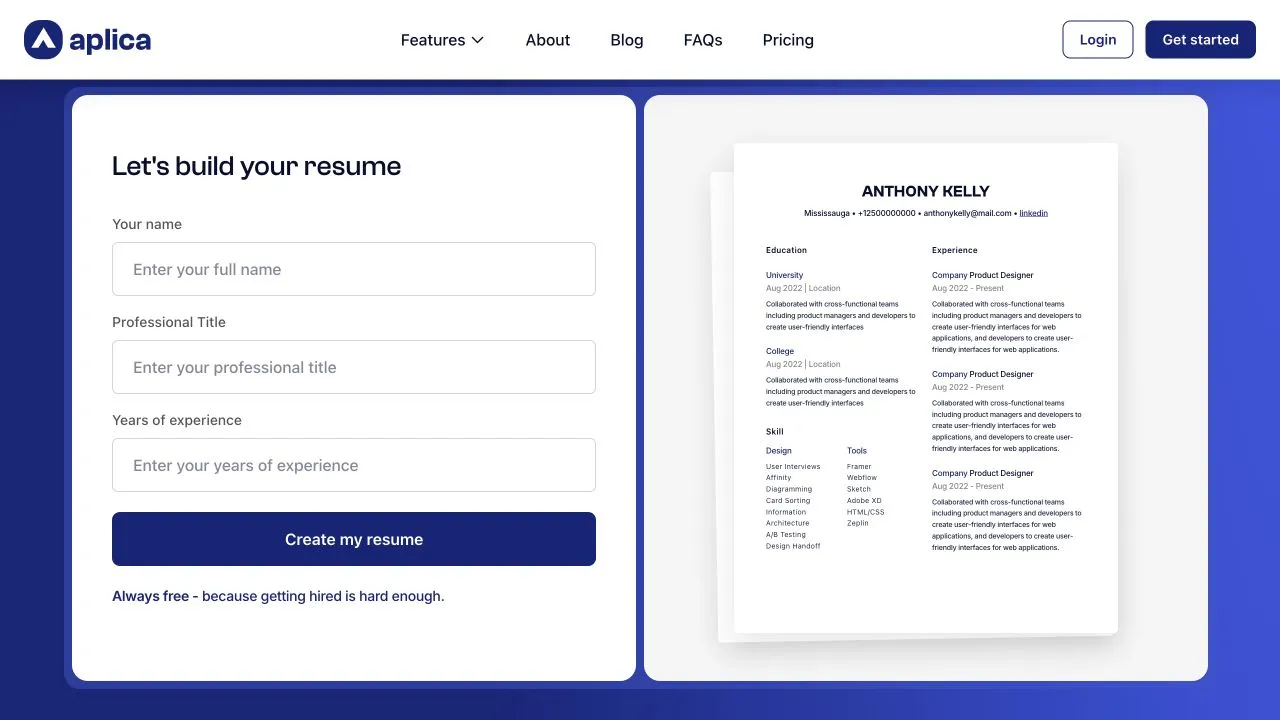
The resume-builder introduction pairs a starting form with a document preview. Visitors can see the information they need to provide and the result they are working toward. The preview explains the destination while the form makes the next step visible.
- Prepare your profile
- Tailor the application
- Explore opportunities
- Track your progress
02 / Interaction
Separating progress from completion
A form-led introduction needs to explain what is required. I separated untouched, edited, invalid, and submitted states, with messages that identify the field and the next correction. Entered information stays available when a request needs another attempt, keeping recovery straightforward.
The document preview demonstrates the format of a possible result. I kept that example distinct from a completed personal document. Transitions into an application workflow need progress feedback, with confirmation reserved for when the resume or application has actually been created.
- Validate at useful moments
- Reveal actionable field feedback after interaction or submission, and keep it associated with the input it explains.
- Label the example
- Present sample document content as a preview, separate from the user's input and any confirmed personal result.
03 / Architecture
Connecting feature pages without flattening them
I grouped the shared parts of feature pages into reusable patterns: a task-focused introduction, supporting explanation, product preview, and a clear action. Consistent foundations help visitors move between resume tools, job discovery, and tracking without relearning the structure of each page.
The interaction inside each feature still needs its own boundary. A starting form is not interchangeable with a job-search preview, even when both occupy the same position in a layout. I favored explicit feature composition over a single component that tries to describe every possible product state.
- Share page structure
- Reuse the surrounding content patterns while letting each feature own its specific preview or interaction.
- Keep explanations portable
- Group each feature's title, supporting copy, image description, and action so its meaning survives layout changes.
04 / Responsive
Making room for the product on mobile
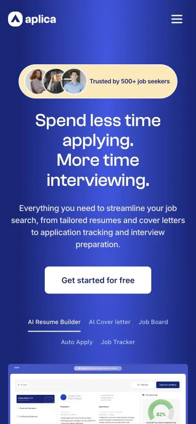
Document previews lose their value if reduced until text becomes a texture. I treated mobile composition as a change in emphasis: introduce the task, give the form or action enough width, and let the preview support the explanation with room to remain recognizable.
Form labels, help text, and errors need to wrap without shifting controls into awkward positions. The order also has to work with the on-screen keyboard open. The public mobile homepage provides the broader context, while feature-specific mobile screens would show these form and preview decisions in more detail.
05 / Quality
Checking the route into the application
I organized delivery checks around the path from a feature explanation to its next action. A button must lead to the expected destination, and its wording needs to match what happens there. Product previews also need to remain distinguishable from controls that visitors can actually use.
The form review covers empty submissions, incomplete fields, long names, visible errors, and retrying after an interrupted request. Keyboard navigation and narrow-screen layouts belong to the same pass. These cases help keep the entry experience understandable before any deeper application logic comes into play.
03 / Looking back
Outcome & reflection
The public site introduces Aplica's main tools and gives visitors a route into the application. Its feature sections make the platform's scope visible without requiring someone to explore the full product first.