

Pluck
Helping people understand asset financing and find a practical path from their first payment to full ownership.
- Role
- Frontend
- Year
- 2025–Present
- Industry
- Asset financing
- Platform
- Web
01 / Overview
The context
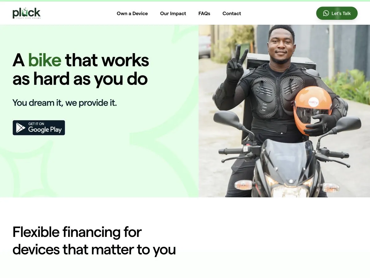
Pluck helps customers access phones and other productive assets through installment payments. I worked on the customer-facing web application, translating product requirements and designs into responsive interfaces. The central challenge was presenting products, financing information, and account activity in a way people could understand and act on.
What I worked on
- Customer-facing pages and reusable interface patterns.
- Interfaces for payments, ownership progress, and account information.
- Responsive layouts and thoughtful handling of application states.
Stack & tools
- Next.js
- TypeScript
- Tailwind CSS
- Paystack
02 / A closer look
The work, in detail.
01 / Journey
A clearer path to ownership
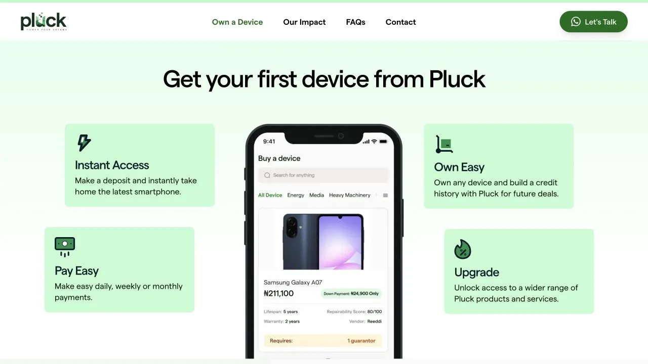
I organized the experience around three financing questions: what can I get, what will I pay, and when will it become mine? That order gives product discovery a clear destination and connects ownership information to the asset being considered.
The public ownership section introduces the deposit and payment journey. Within the account, the same hierarchy can carry through: identify the asset, show the next commitment, then reveal the supporting detail. Customers need a complete picture of their position.
- Choose an asset
- Understand the plan
- Start ownership
- Track progress
02 / Interaction
Making payment status unambiguous
Payment interfaces need to distinguish a request in progress from an action that has completed. I treated loading, confirmation, and failure as separate states, with feedback beside the action that triggered them. An interrupted request still needs a clear outcome.
The same care applies when account information is unavailable. A missing balance is different from a balance of zero, and a payment history that has not loaded is different from an empty one. Labels and recovery actions carry that distinction through to the screen.
- Confirm before completing
- Keep the submitted action visible until its outcome is known; show confirmation only from a confirmed result.
- Recover in context
- Keep the selected asset and entered information when an action fails, with a clear way to retry.
03 / Architecture
Reusing patterns without losing meaning
I separated shared presentation patterns from the meaning of the information they display. Product summaries, payment rows, status messages, and account sections can reuse spacing and interaction rules, while their labels remain specific. A reusable card should not make every financial value look equally important.
That boundary also keeps formatting predictable. Currency, dates, and payment periods belong to consistent display rules, while each screen decides which value leads. The tradeoff is a little more explicit composition in exchange for fewer components that depend on a growing collection of unrelated options.
- Consistent formatting
- Give amounts and dates one presentation rule so summaries and detailed views do not contradict each other.
- Explicit hierarchy
- Let the screen prioritize the next payment or ownership progress instead of hiding that choice inside a generic card.
04 / Responsive
Keeping the essentials in view
On a phone, I prioritized a stable reading order over reproducing the desktop arrangement. Asset identity, the important amount or explanation, and the next action stay together. Supporting information follows in smaller groups, so a narrow screen does not turn into a wall of equally weighted content.
The public mobile homepage shows the starting point of that hierarchy. Product imagery introduces the offer, while the action remains close to its explanation. For denser account views, the same approach means allowing labels and values to wrap naturally rather than shrinking the whole interface.

05 / Quality
Reviewing the moments that affect trust
I framed delivery checks around recognizable customer situations: a new account without history, a plan with upcoming payments, a failed request, and a long list of activity. Those cases expose misleading empty states, unstable layouts, and unclear recovery paths that a populated screen can conceal.
The review also covers long asset names, large amounts, keyboard access to actions, and visible focus after feedback appears. The aim is consistency between what the interface says and what the customer can do next, especially when information is incomplete or an action needs another attempt.
03 / Looking back
Outcome & reflection
The customer-facing experience connects access to financed products with the information needed to manage ownership. The public website introduces that journey through product categories, payment explanations, and answers to common questions.