

Reeddi
Connecting a climate technology mission with tangible products that help people access energy and essential equipment.
- Role
- Frontend
- Year
- 2022–2023
- Industry
- Clean energy
- Platform
- Web
01 / Overview
The context
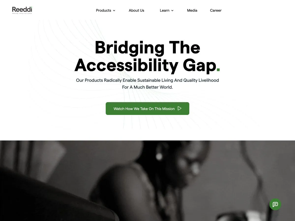
Reeddi develops solutions for renewable energy access and equipment rentals. Its website brings together portable energy products, a rental marketplace, and the company's broader mission. The frontend challenge is to turn that broad offering into an approachable web experience, helping visitors understand both the purpose of the company and the products available.
What I worked on
- Frontend page and component implementation.
- Presentation of product information and the company story.
- Responsive layouts for imagery, navigation, and content sections.
02 / A closer look
The work, in detail.
01 / Journey
Giving the mission a practical meaning
Reeddi's mission covers energy access and equipment rentals, so I organized the story around practical questions. A visitor needs to recognize their need, find a relevant product, and understand how to access it. The company story supports that progression.
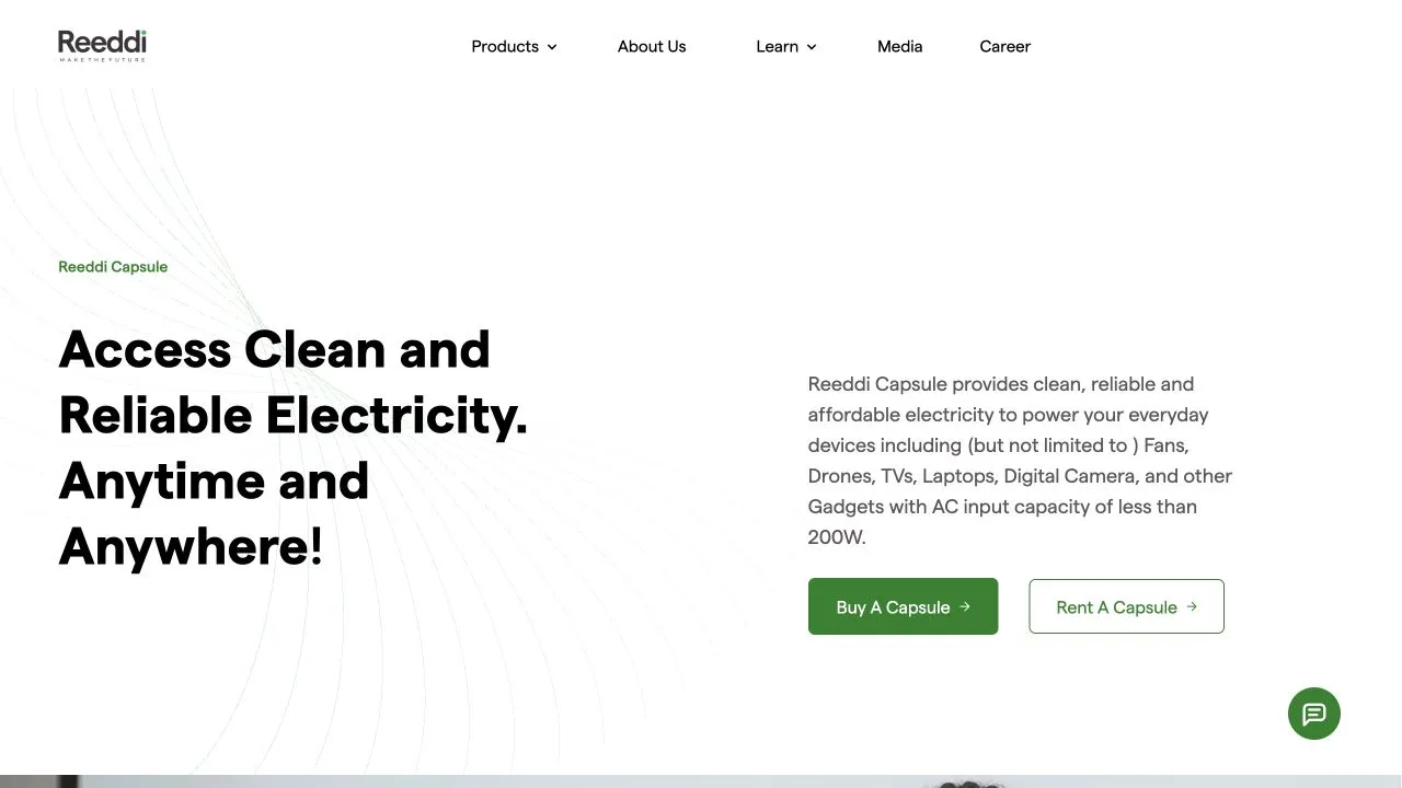
The Capsule page introduces a portable source of electricity, explains what it can power, and offers purchase and rental routes. Keeping capability and access close together connects the broader mission to a decision someone can make about their own situation.
- Identify the need
- Explore a product
- Understand its uses
- Choose an access route
02 / Interaction
Making product and access choices distinct
A product menu and a purchase or rental action answer different questions. I treated navigation as the place to compare the available solutions, while the product page provides the context for choosing an access route. That separation keeps a browsing decision from feeling like an immediate commitment.
Menus also need a complete interaction model: visible open state, keyboard entry, a predictable close action, and focus that returns to its trigger. For links that leave the current product story, the label needs enough context to explain the destination before the visitor follows it.
- Name the destination
- Use product-specific purchase and rental labels so similar actions remain understandable when encountered out of context.
- Complete menu behavior
- Treat opening, selecting, dismissing, and returning focus as parts of the same navigation interaction.
03 / Architecture
Structuring content around the offering
I organized repeated product information around a clear content shape: name, purpose, imagery, useful details, and available actions. That creates a consistent foundation for presenting the range without suggesting that a portable energy product and a rental marketplace have exactly the same explanation or requirements.
The tradeoff is to share the parts that repeat while leaving room for dedicated product sections. Capability information needs careful units and context; a company mission section needs a different rhythm. Keeping both in one highly configurable block would make the content harder to understand and maintain.
- Preserve product meaning
- Keep capability labels and units attached to their values instead of treating them as interchangeable promotional statistics.
- Compose around the story
- Reuse typography, spacing, and action styles while keeping mission, product, and customer-story sections distinct.
04 / Responsive
Preserving the story on mobile
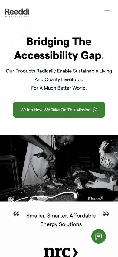
The desktop site moves between large imagery, product explanations, and customer stories. On mobile, I reduced competing elements and preserved the relationship between heading, image, and description. Each section needs to make sense before the next one enters the screen.
Hardware imagery needs enough space to communicate the product without pushing its explanation too far away. Product actions can then stack in a clear order with room for longer labels. The mobile homepage is a context image here; deeper product screens would demonstrate the more detailed layout decisions.
05 / Quality
Reviewing information as carefully as layout
I treated content accuracy as part of the frontend review. Product names, capability descriptions, units, and purchase or rental destinations need to stay consistent across navigation and detail pages. A polished component cannot compensate for a label that sends someone toward the wrong offering.
The layout review covers images before they finish loading, unusually long descriptions, stacked actions, and open menus at narrow widths. Meaningful image descriptions and keyboard access complete that pass. These checks focus on keeping the product understandable through the small variations that real content introduces.
03 / Looking back
Outcome & reflection
The website brings Reeddi's mission and product range into one public experience. It offers an introduction to the company and routes into individual solutions for people exploring energy access or equipment rentals.